It’s probably not a total surprise that when it comes to aesthetic, I’m firmly in the minimalist camp.
While I have great respect for masterful and intricate artistic details and what it takes to create them, I’m obsessed with the power of simplicity. I love how some simple, clean lines, a well-chosen neutral color palette, or the simplest typography can evoke so many feelings and associations, can cut through the noise, and tell stories.
I love collecting and curating minimalist brand examples. Even though I’m not an artist or design creative myself, I get an immense inspiration from them – for my own blog, when I advise clients on art direction and styling, for my photography, or just my own life and the kind of aesthetic I’d like to surround myself with.
Of course, design trends come and go. One decade is all about maximalism and artistic, intricate details. Then the pendulum swings back and everyone is striving for simpler, cleaner forms. But some things and design principles will always be above trends and I think a minimalist aesthetic firmly checks out all those boxes. It’s timeless, evocative, doesn’t take attention away from the product or content, and it’s easy to recognize and take in.
As Leonardo da Vinci said: “Simplicity is the ultimate sophistication“.
These are some of my favorite minimalist branding aesthetics – I deliberately chose well-known brands, just to show that minimalism is not the favored aesthetic of only indie brands, but that it has become the primary choice for many leading companies.
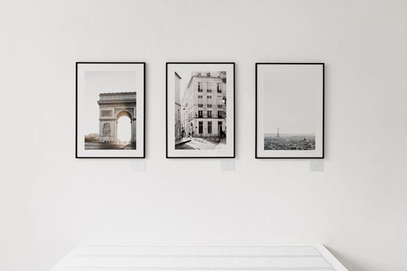
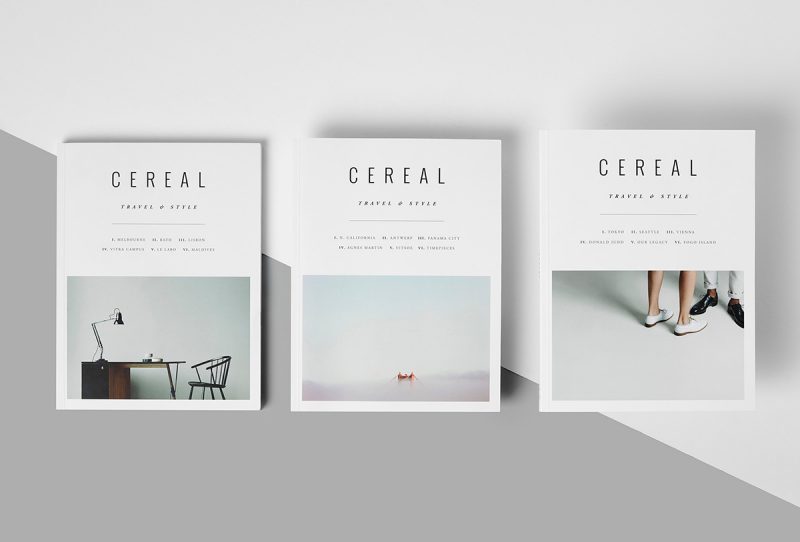
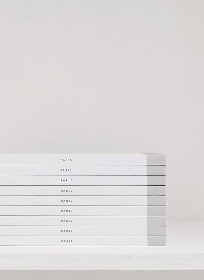
The magazine – Cereal
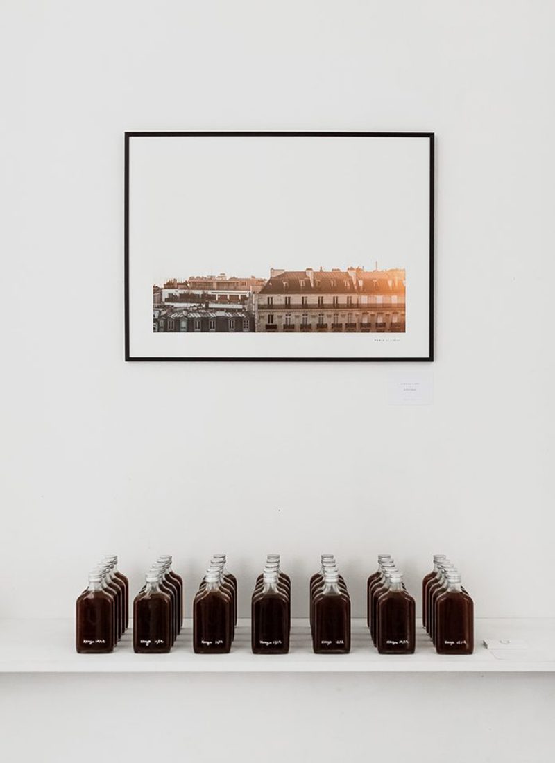
Source: Photo by Ash James at Cereal Paris Guidebook Launch


Photos by Rich Stapleton: Maldives and Curated Essentials series
Cereal has been founded by writer, editor Rosa Park, and designer, photographer Rich Stapleton in 2012 and has quickly become the ultimate travel and style guide of people fond of minimalist aesthetic, design, and beautifully styled and curated content. And it’s safe to say that the modern, crisp, timeless visual identity and aesthetic of the brand played a huge part in that.
From the covers through the editorials and photography to the offline experiences, everything is centered around the trademark Cereal minimalism – clean lines, lots of white space, muted colors, a unique photo style. The story of Cereal is also a beautiful example of slow branding and putting quality over everything else. The magazine is biannual; the editorials are always of the highest quality, and there are only 3 guides so far, despite the incredible popularity. Proof that slow building, quality content, and a sharp visual and editorial focus do pay off.
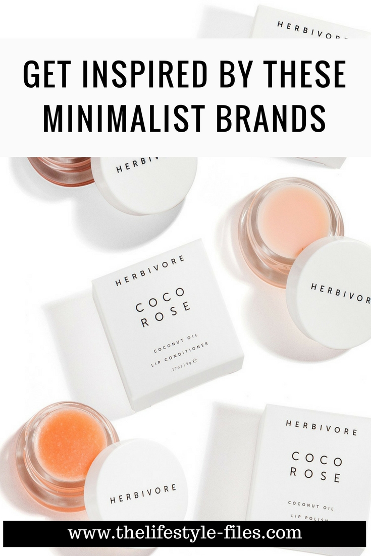
The skincare brand – Herbivore Botanicals
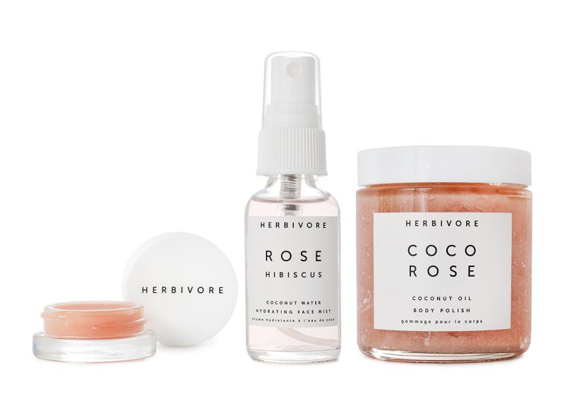
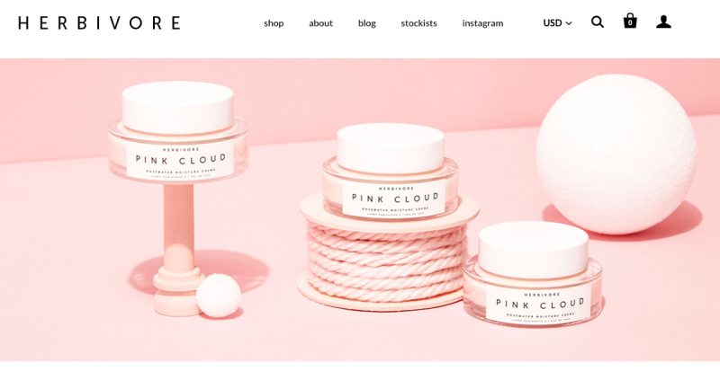
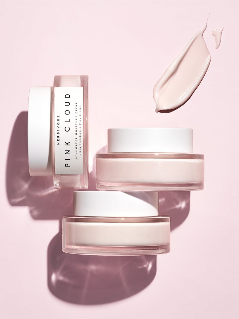
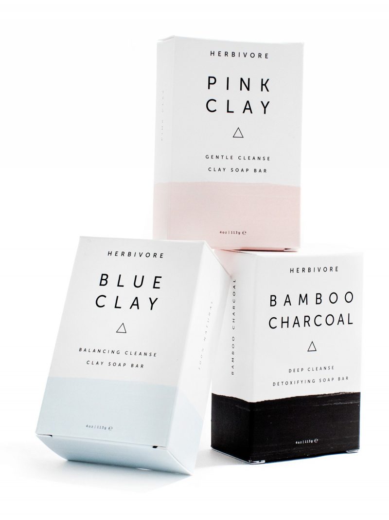
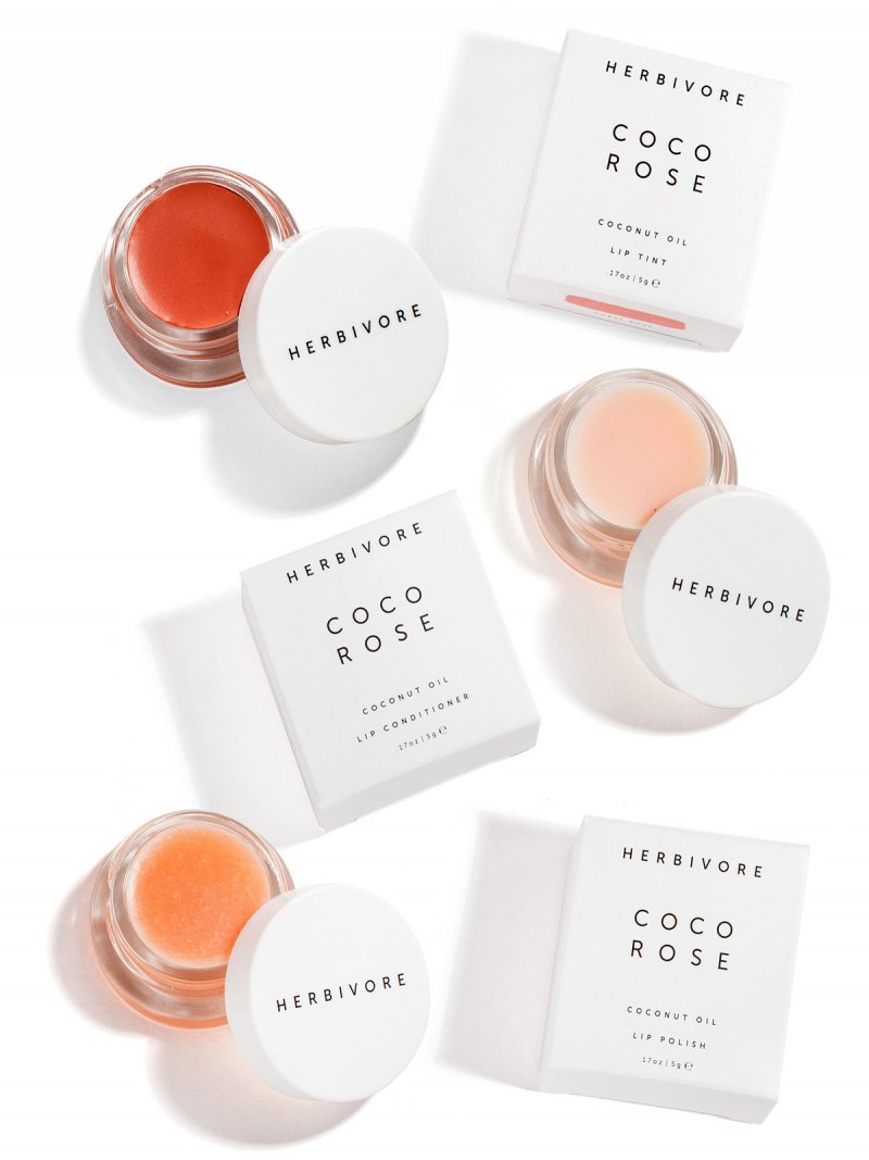
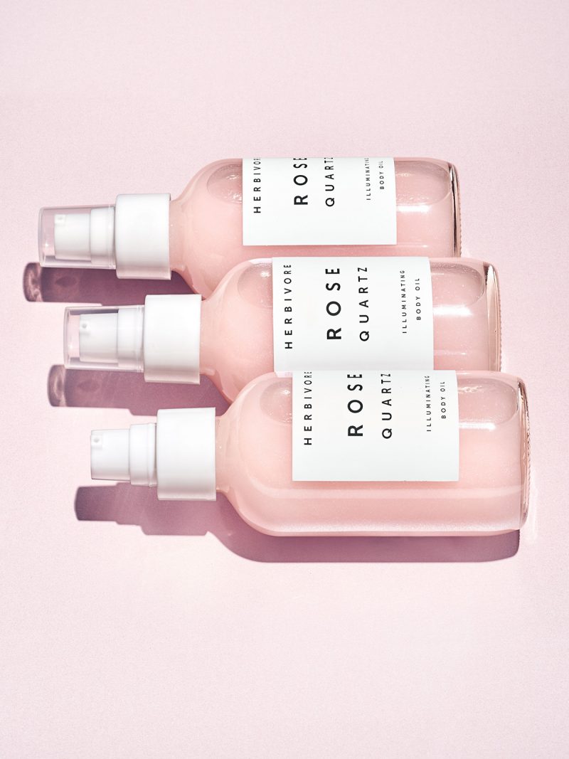
Source: Herbivore Botanicals. Design by Alex Kummerow and Julia Wills
Herbivore Botanicals started out as an indie brand from Etsy and has become the darling of many natural beauty fans around the world, and their distinct, minimal branding and packaging became just as famous as the actual products.
From Glossier to The Ordinary, skincare brands are increasingly making visual statements with their simple, minimalist design. They convey elegance, freshness, and a no-fuss attitude towards skincare – catering to design-savvy men and women who appreciate the aesthetic elements just as much as effective ingredients.
Herbivore Botanicals branding (designed by founders Alex Kummerow and Julia Wills) is built upon simple typography and geometric shapes, cool pastel pink and light blue tones, and simple design elements playing upon some associations between effectiveness, freshness and simplicity. As their mission statement says “We also believe skin care should smell and feel amazing and add enjoyment to your daily routine”, confirming that the sensory effects and the visual aesthetic (and the accompanying lifestyle associations) are just as integral to the brand experience as the products themselves.
The café – Happy Bones, New York
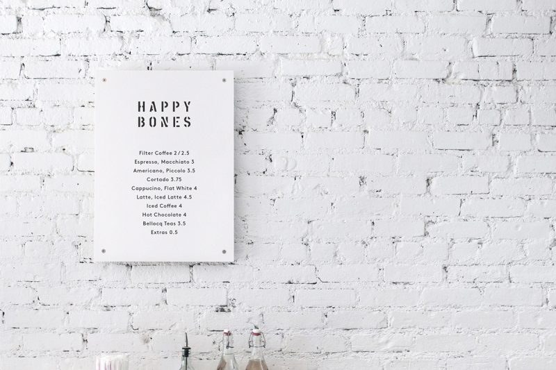

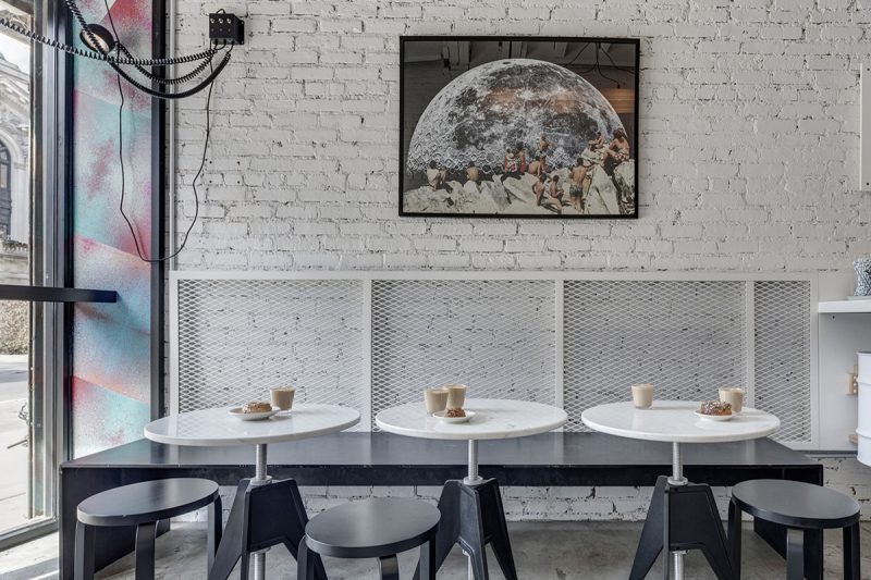
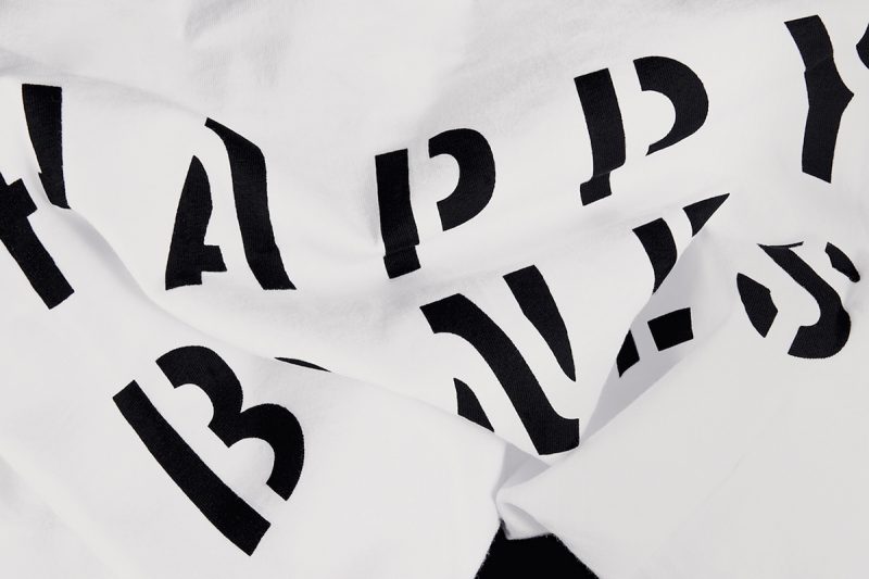
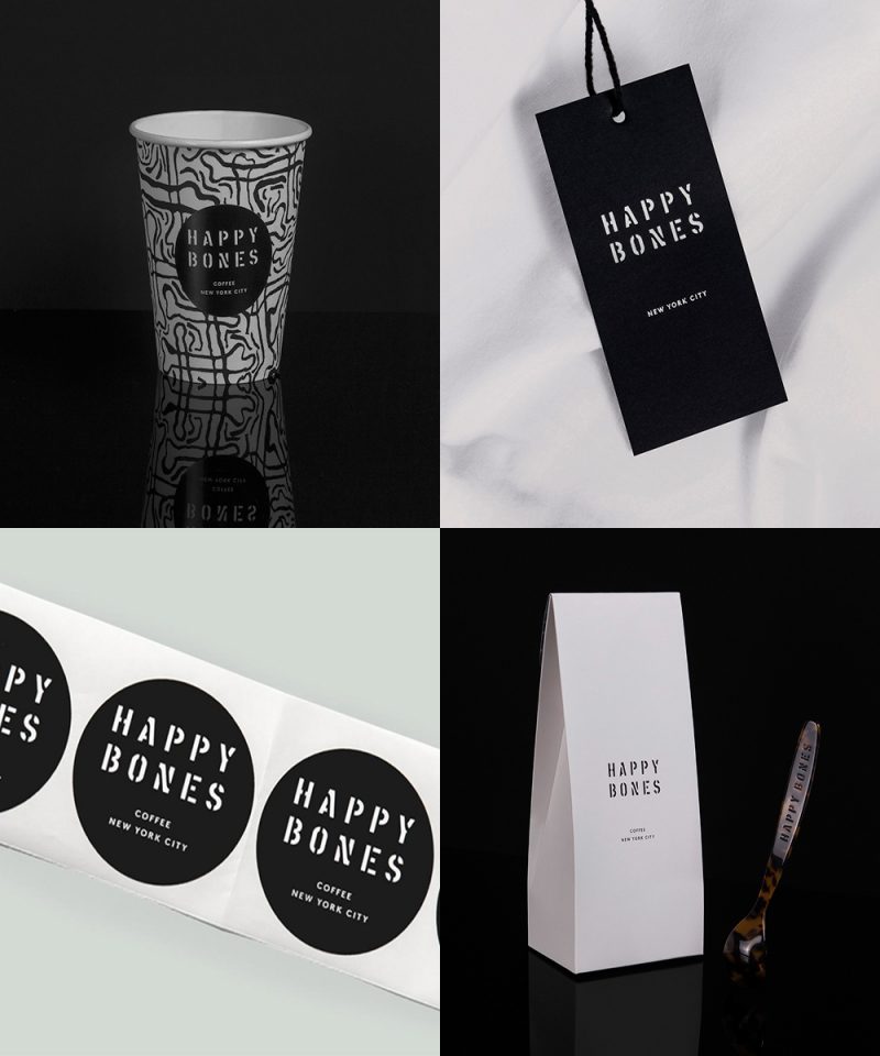
Design by Lotta Nieminen Studio
A hit (with good reasons) among New Yorkers and the subject of thousands of Instagram post, Happy Bones’ branding was created by illustrator and designer Lotta Nieminen. I love Lotta’s work and aesthetic – it’s minimal, creative, elegant, crisp, unique. The Happy Bones visual identity is the epitome of what I’d call modern, cool, urban minimalism.
While Lotta does not shy away from using colors in her minimalist design, Happy Bones has a mainly black and white color palette. The stylish, yet minimal, clean aesthetic fits well with the brand mission of creating an urban spot for coffee and art lovers, serving great coffee, and curating and showcasing contemporary art pieces.
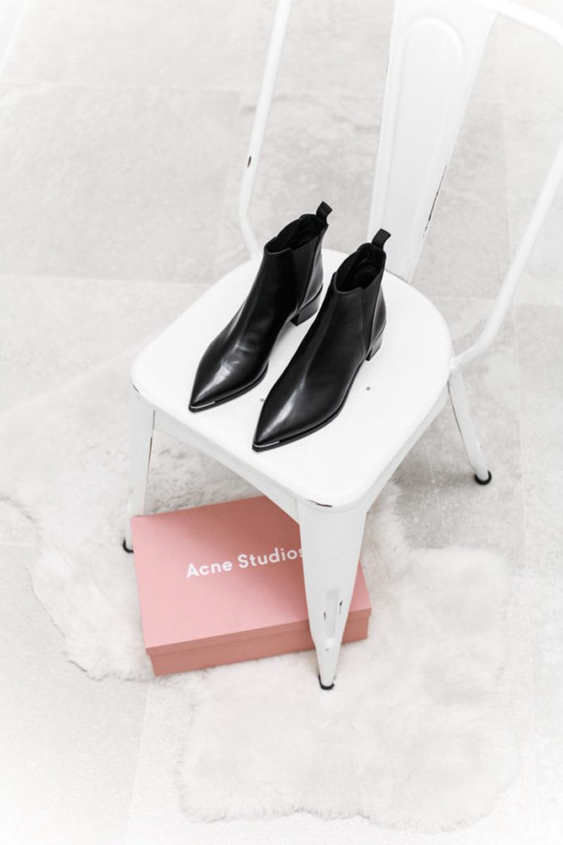
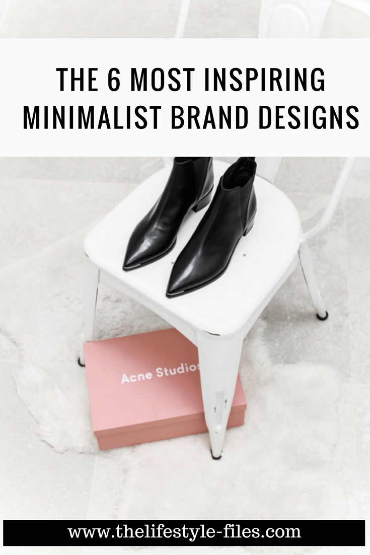
The fashion brand – Acne Studios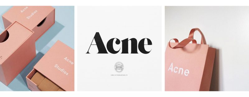
Source: Acne Studios and This is glamourous
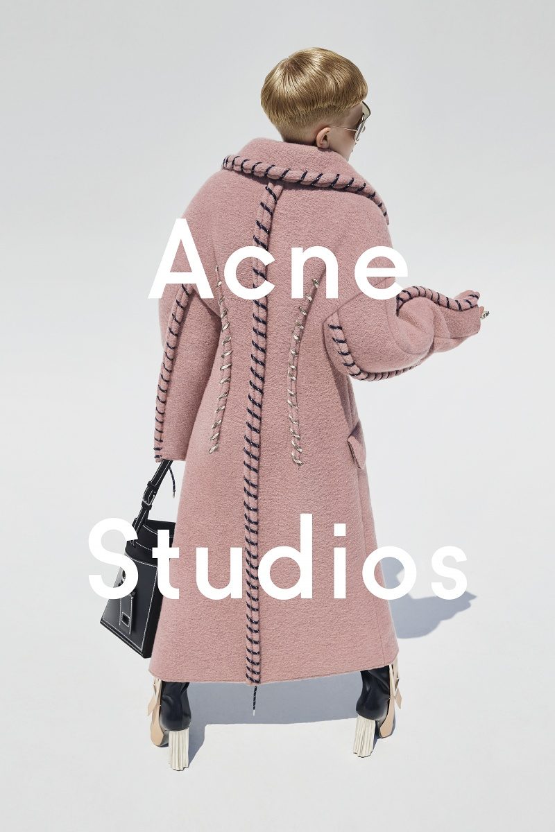
Source: Modern Legacy and Acne Studios
Not many people know, but fashionista and Instagram darling brand Acne Studios didn’t start out as a fashion brand – it was founded more than 20 years ago as a digital creative consulting collective, the fashion direction only came later. This creative foundation is very palpable in the brand philosophy and visual identity of Acne. It has a distinct minimal aesthetic paired with a cool, laid-back attitude, and the branding and visual style are totally in line with the simple, functional, yet stylish garments as well.
Acne relies on visual design and iconic branding a lot more than on traditional marketing – and as evident in the thousand Acne bag Insta photos, it really works. They work with black, white, and their signature pink color, minimal typography, a mix of simplicity and edginess – the strong creative flair is evident in all their designs.
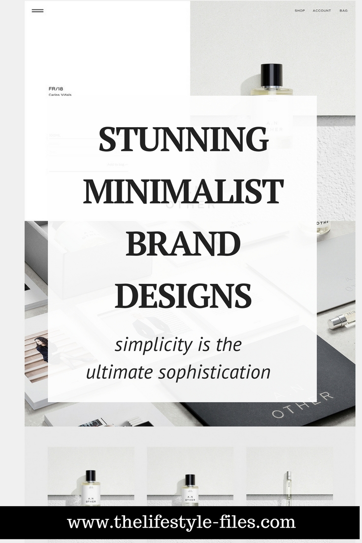
The perfume – A.N. Other
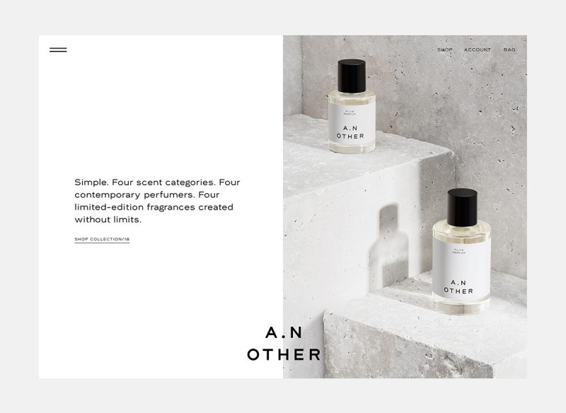
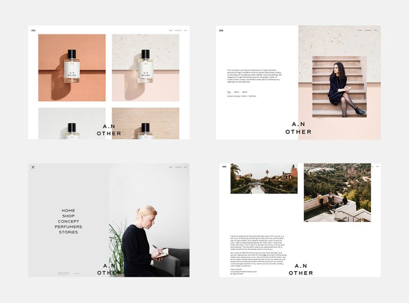
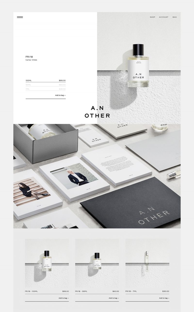
Source: Branding, Packaging & Opinion. Design by Socio Design
Branding has always played a critical role in fragrance marketing. Often, the packaging and design have become just as iconic as the fragrances itself. One of the reasons for this is that out of all the skincare and beauty products, perfume is probably the most personal. A scent can become a symbol of a lifestyle, personal style, personality, and status. And while the fragrance itself is still the most important component, we cannot underestimate the evocative power of the packaging, the labels, and the overall aesthetic.
In recent years, a lot of niche luxury perfume brands have emerged as aesthetic leaders of the industry, from Byredo through Le Labo to A.N. Other. Their minimal, simple packaging and visual identity came to be associated with understated luxury and a modern, chic lifestyle and became visual icons in the social media world and lifestyle publications.
The tech giant – Apple
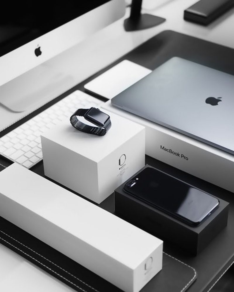
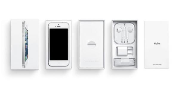
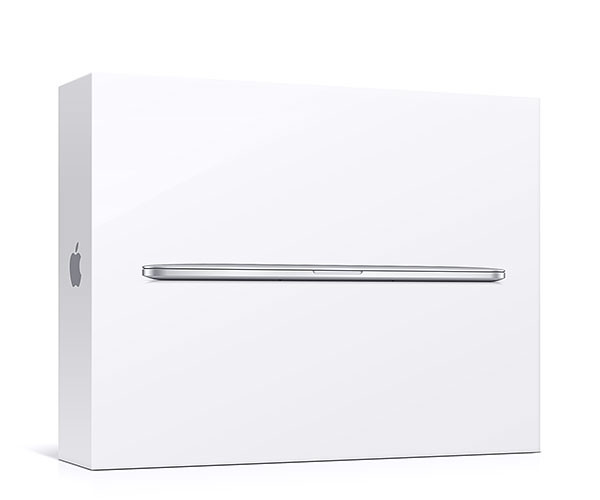
There cannot be a post on minimal branding without mentioning one the most iconic examples ever – Apple. Apple successfully leveraged the evocative nature of simple forms and built a visual identity that is indistinguishable from the products themselves. For Jobs, minimal design was not the easy way out – it was the end result of a very complex process: “Simple can be harder than complex. You have to work hard to get your thinking clean to make it simple”. He really represented the 20th-century version of Leonardo da Vinci’s simplicity manifesto.
Apple’s aesthetic and Steve Jobs’ personal views on and philosophy regarding the aesthetic and functionality of design have been some of the most important inspirations for me. The attention to details, the power of simplicity, the powerful duo of form and function are guidelines that I really think we can all employ in our everyday creativity.


[…] Take UK-based travel and style magazine Cereal for instance, which adopts a highly minimalistic style in its branding and design. From its editorials to its photography, the Cereal publication centers around clean lines, white spaces, neutral colours and a photo style that is consistent with their brand (Source: thelifestyle-files.com). […]